Improvement Plan
original lyric sheet
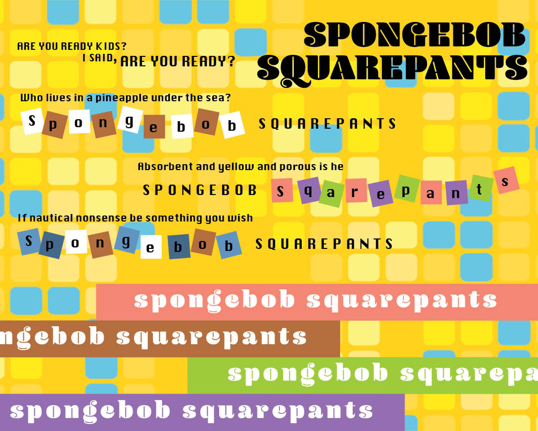
Jia yu Hong and I discussed that these following things needed changes.
Bigger left right margin
Fitting in all the lyrics
more simplified structure
either keep background or letter squares because the squares are competing
font size too large
two font sizes are competing, so create more hiearchy
keeping the busyness in check
experimenting with the title alignment
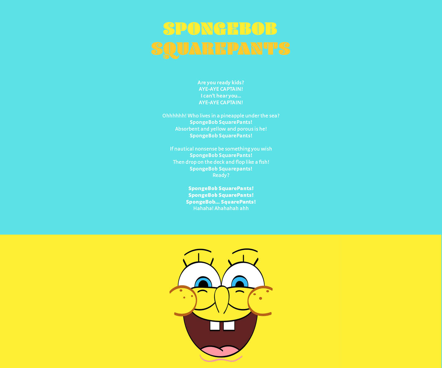
Round 3
My second partner was Rhea K.
adding back some fun visual elements.
Larger top margin
Not all letters in the title and lyrics are legible. Possibly choose a different color?
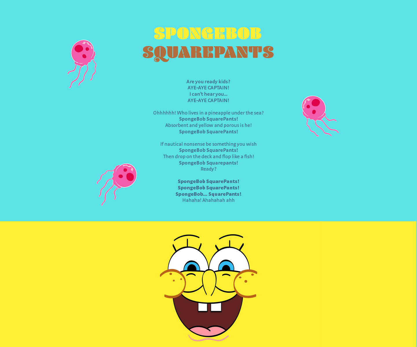
I plan to have the jellyfish as fixed images as you scroll down the page.